As a Pinterest manager, my goal is to provide as much clarity and actionable insight as possible. The more informed you are, the stronger your account standing will be. Whether you’re DIYing your strategy or working with a professional, I want you to understand how the platform sees your content and how to build a lasting presence.
If you’ve ever been told to “stay on brand” with your Pinterest pins, you’re not wrong—but you might be overdoing it.
I see a lot of bloggers and small business owners fall into a trap: their pins look so visually consistent (same fonts, layout, brand colors) that they become virtually invisible in the Pinterest feed. They blend in rather than stand out.
This is what I call the Over-Branded Trap — and it can quietly stall your growth.
Editor’s note: Originally published in May 2025, this article has been updated to reflect current Pinterest behavior around visual freshness, repetition, and signal clarity in the feed.
What Is the Over-Branded Trap?
Over-branded pins happen when:
- You use the same Pinterest graphics or layout repeatedly
- Your brand colors dominate every design
- You rely on one font style, one pin aspect ratio, and minimal variation
You might be aiming for brand recognition, but Pinterest is a visual search engine—fresh pins with high-quality images, strong focal points, and varied design styles win.
If your pins all look the same, Pinterest (and your audience) might scroll right past.
Why It Hurts Your Pinterest Performance
Pinterest users aren’t seeing your pins in a vacuum. They’re viewing them in a scrollable feed, likely on mobile devices, alongside dozens of other pins. Your pin has one job: stand out.
Too much repetition weakens Pinterest’s confidence that your content is new or distinct. Worse, it tells users, “You’ve seen this already.”
Over time, this hurts:
- Click-through rates
- Save counts
- Reach across the Pinterest feed
Instead of being seen as fresh pins, your pins get lost.
And Pinterest itself is clear in its best practices: avoid repetitive visuals and focus on freshness. Repeatedly circulating the same image and URL combination can reduce distribution and limit visibility over time.
Good Pinterest Pin Design That Works
Let’s break down the design process for a scroll-stopping pin:
1. Aspect Ratio Matters
For standard Pinterest pin sizing, stick to 1000x1500px (2:3 ratio). Anything taller may be cropped, and shorter pins tend to underperform.
2. Use White Space Intentionally
Crowded pins are hard to read and unappealing on mobile. White space creates breathing room and draws attention to your focal point. It’s one of the most essential things for legibility. Be careful though to not leave too much white space.
3. Choose Fonts for Readability
Avoid long strings of script fonts. A beautiful font means nothing if it’s unreadable. Use bold, easy-to-read fonts for headlines, and limit the script to small highlights. Remember too that the largest group of users growing on Pinterest are the Gen Z’ers who may not have been taught to read script.
4. Highlight the Focal Point
Your image should support the topic. Whether it’s food, a product, or a lifestyle shot—make sure the focal point is clear and complements the text overlay.
5. Prioritize Clear Text Overlays
Overlay your text in areas with contrast. If needed, use semi-transparent boxes or outlines. The goal is to make your PIN readable at a glance on a small screen.

Cater to Your Audience, Not Just Your Brand
Many creators get this wrong: they design for their business goals, not for their target audience.
Ask yourself:
- Does this pin speak to what my audience is searching for?
- Am I using different pin templates and visual styles that fit different content?
- Or am I pushing my brand name, logo, and color palette so hard that the message is lost?
Your brand colors and fonts matter—but they should enhance, not dominate.
Creating beautiful pins that serve the user is a great way to build engagement.

Warnings About Heavily Branded Content
1. Don’t Overuse Your Logo
Placing your logo on every pin in a dominant spot doesn’t build trust—it might just turn viewers off. Keep it subtle and strategic.
2. Rigid Color Palettes Can Backfire
Pinterest users respond to visual variety. Sticking to the same three brand colors can make your pins blur together. Use different colors occasionally to better suit seasonal content or stand out.
3. Watch for Low Contrast
Brand colors aren’t always high-contrast. If your favorite palette is difficult to read, especially on mobile, it’s time to adapt. Pinterest favors clarity.
4. Designing Only for Your Brand = Missed Opportunities
Using your Canva brand kit might look good, but it doesn’t mean it performs well on Pinterest. The design process for Pinterest needs to factor in the Pinterest feed, not just your homepage.
5. Users Don’t Know Who You Are Yet
If someone has never visited your site, your brand identity means little. They’re looking for useful, attractive content—not whether your pins match your website.
Not Everyone Has an Artistic Eye—Here’s What to Do Instead
I use my art and design background to evaluate:
- Layout and balance
- Font size and contrast
- Use of color and white space
But if you’re not a designer, use this quick checklist before publishing your pins:
Pinterest Pin Scroll Test Checklist
- Would this pin stop me mid-scroll?
- Is the text legible on mobile devices?
- Is the color palette attractive but different from the surrounding pins?
- Have I reused this exact layout too many times?
- Would someone new to my Brand know what this pin offers?
Even using different fonts, colors, and styles can help.

Final Thoughts
Visual Variation Supports Freshness Signals
To better visualize how Pinterest counts a pin as “fresh,” here’s a simple batching structure that incorporates new images—not just text changes:
One URL → 5 Templates → 4 Images per Template → 3 Titles per Image = 60 Fresh Pins
Pinterest prioritizes pins with new images—not just text or color changes.
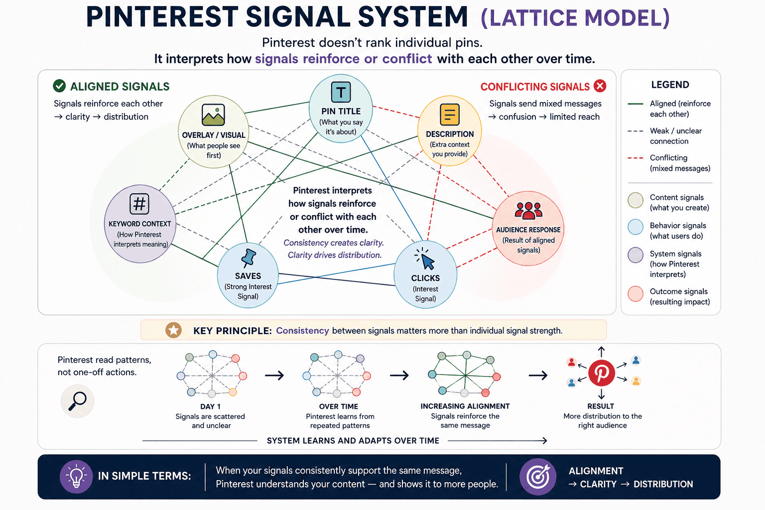
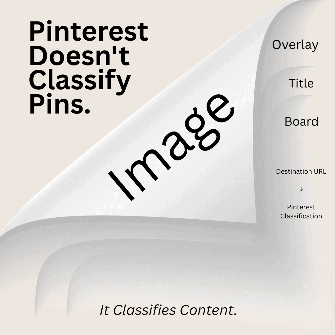
If you want to understand why visual sameness affects visibility, this ties directly into how Pinterest assigns and reinforces annotations behind the scenes. You can read more about that process in my guide to Pinterest annotations and signal alignment.

Quick Note on the 60 Fresh Pins Diagram
You may have seen visual examples showing how one URL can produce 60 “fresh” pins with a combination of templates, colors, and titles. While that method does offer a powerful batching strategy, it’s important to clarify that true freshness is most effective when it includes new images too.
Just swapping colors, fonts, or overlays will give your pin some traction—but Pinterest has made it clear that the highest value comes from content that also incorporates new photos, image crops, or visuals. Aim to vary at least two elements (image, layout, overlay, color) when repinning the same URL to maximize reach.
The good news is that a few simple design shifts can make your pins beautiful, effective, and algorithm-friendly again.
Need help getting out of the over-branded rut? That’s where a Pinterest strategist comes in.