
If you’ve been making pins, or even just scrolling Pinterest lately, something probably feels off.
Your images aren’t showing the way you designed them.
Pinterest pins are getting cropped in strange ways, layouts don’t line up, and the feed doesn’t look as clean as it used to.
If you’ve noticed your Pinterest pins getting cropped, you’re not imagining it.
At first, it feels random.
But it’s not.
Pinterest is fitting different image sizes together to keep the feed moving.
Think of it like a puzzle. Your pin isn’t shown one fixed way anymore, it’s placed wherever it fits.
Pinterest is changing how images are displayed, and that’s affecting everything from how your pins look to how they perform.
Most creators are used to working with a set aspect ratio, usually the standard pin size, and expect that format to hold. What’s changed is not just the size, but how different pin formats are being displayed across the feed.
Recommended Pinterest Image Sizes (What They Still Say)
Before getting into what’s changing, it helps to look at what Pinterest still recommends.
The standard pin size is:
- 1000 x 1500 pixels (2:3 aspect ratio)
This is still considered the recommended size for standard pins.
Other common formats include:
- Square images, 1000 x 1000
- Vertical pins, up to around 1000 x 1800
- Video pins and idea pins, which often follow vertical formats
This is how a standard pin is designed to look.
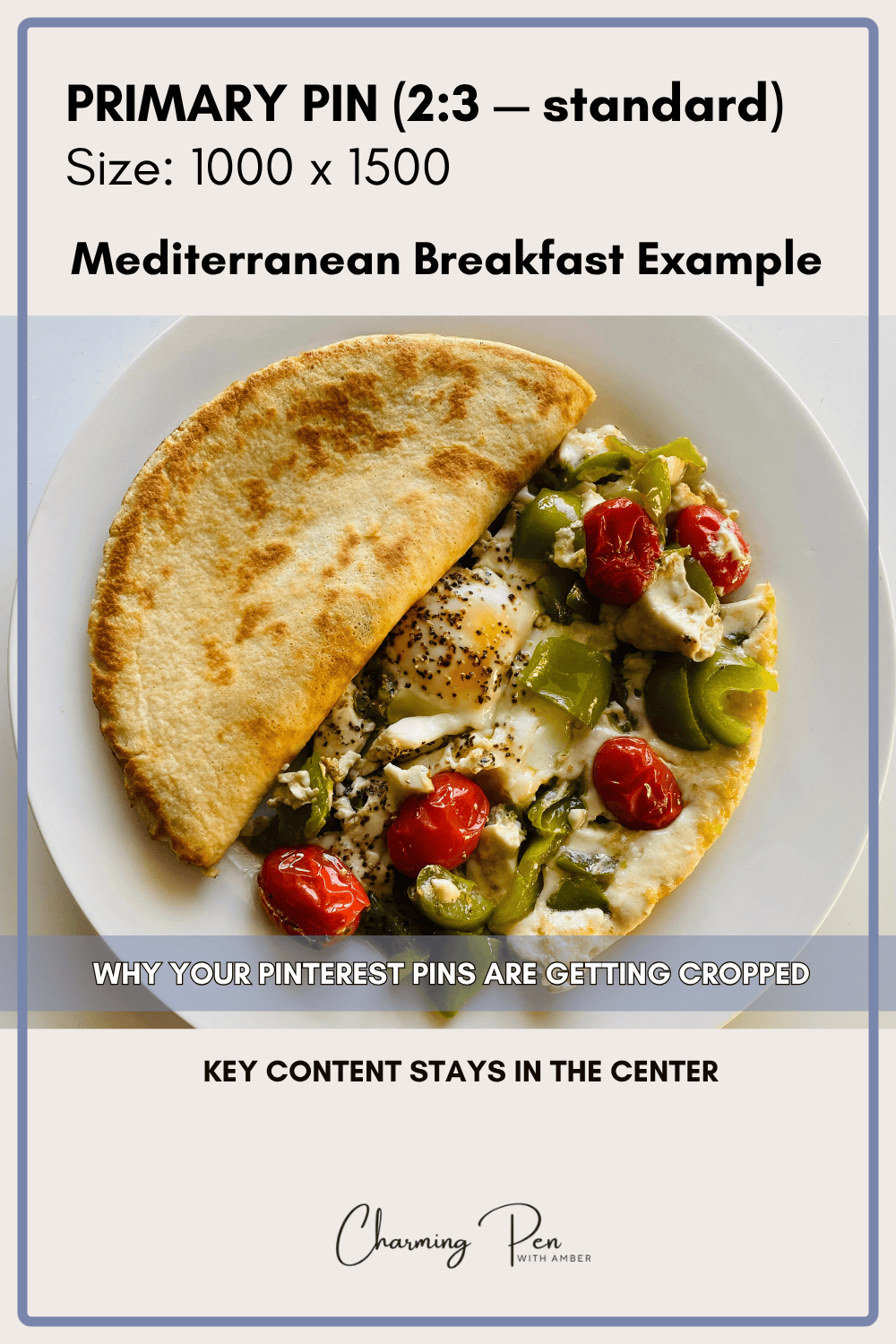
These are the correct dimensions according to Pinterest’s best practices.
And technically, they still work.
The issue isn’t that these sizes are wrong. They’re just being used differently now.
The Feed Doesn’t Just Feel Off, It Feels Messy
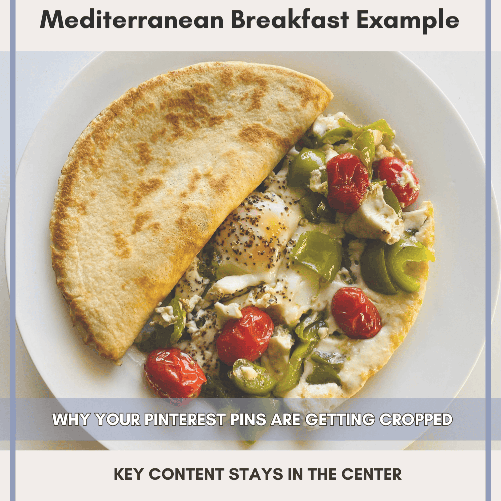
It doesn’t just feel random, it feels like a mess. This shows up the most with vertical pins and taller images. What used to work as a long pin doesn’t always translate cleanly when Pinterest crops it down.
I’ve made pins in a 9:16 format, like Instagram Reel size, and Pinterest will take that image and center-crop it into a square. What ends up showing is the middle of the image, while the text at the top or bottom gets cut off.
So you’re left with a pin where:
- part of the headline is missing
- part of the image is missing
- the whole thing looks off
At that point, it’s not just inconsistent, it’s messy, and if someone can’t quickly understand what they’re looking at, they’re not going to click. If your pins look fine when you design them but fall apart in the feed, this is exactly the kind of issue I break down in my Pinterest forensic audit.
If you want to go deeper into how layout and visual hierarchy affect clicks, I break that down more in my guide on Pinterest pin design strategy.
When you scroll the feed, you can see it happening over and over again. Different sizes, different crops, things not lining up properly. It doesn’t feel intentional, it feels forced.
That’s where the idea of square pins starts to make more sense. Square images aren’t replacing the recommended size or correct dimensions, but they are becoming a reliable option when you want your layout to hold its shape without being altered.
A square pin holds its layout no matter where it’s placed.
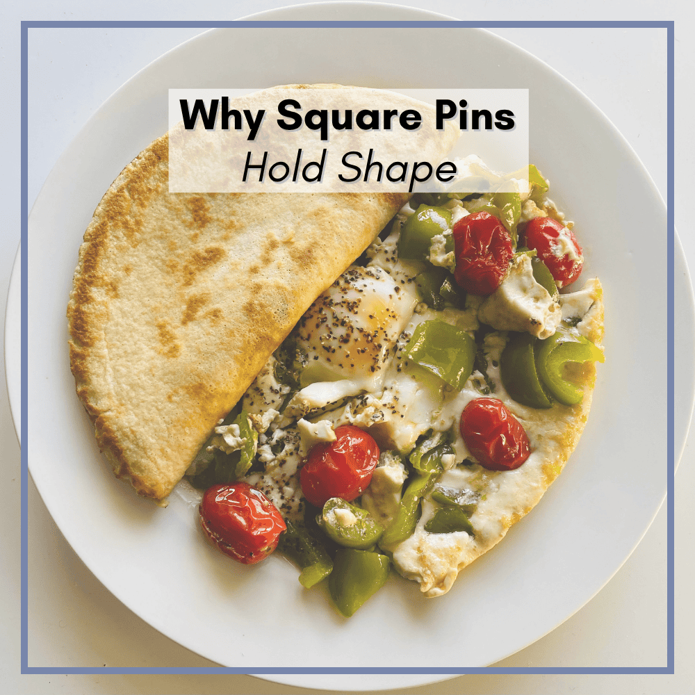
Because if Pinterest is going to keep pushing content into square placements, then square images are the only ones that hold their layout without breaking.
If this keeps going the way it is, users are going to notice. People don’t want to scroll through something that feels disjointed or hard to look at.
You open Instagram, everything is clean and consistent.
Pinterest used to feel more like that.
Now it feels like a mix of everything, with different formats competing for space at the same time.
That’s why things don’t line up the way they used to.
You open Pinterest right now, and it can feel like a mess.
Mobile Behavior Is Driving This
Most people are using Pinterest on their phones, and they’re scrolling quickly.
That changes how pins need to work.
A tall pin takes up more space and asks for more attention. A square pin is quicker to process. You see it, you understand it, and decide whether to click.
Pinterest is still built around that kind of behavior now. The feed is designed for fast scrolling, not careful viewing.
That’s part of why these tighter crops and mixed layouts are showing up more often.
Why Pinterest Pins Are Getting Cropped Right Now
This isn’t something that might happen later. It’s already happening.
Pinterest is trying to fix a lot of problems at once.
When people say the platform feels like a dumpster fire, they’re really talking about a bunch of smaller issues happening at the same time.
Honestly, it’s more like a wildfire.
You’ve got one issue here, another popping up there, and none of them are fully contained yet.
There’s the AI image problem.
There are the metrics, which have felt off for a lot of people this year.
There are distribution issues.
And now there’s this image sizing problem that’s affecting how the feed actually looks.
All of these things are happening at once, and Pinterest has to deal with them.
The image issue matters more than people think because it affects the user experience directly. When the feed looks messy, people notice. It doesn’t feel clean, and it doesn’t feel easy to scroll.
And Pinterest isn’t going to ignore that.
What Pinterest Is Likely To Do Next
At some point, Pinterest has to decide how it’s going to handle this.
They have two options.
They can pull back on these square and mixed placements and try to clean up the layout.
Or they can lean into what’s already happening and start favoring images that fit those placements properly.
If you look at how the platform is set up, especially with ads, it’s pretty clear which direction makes more sense.
Pinterest runs a lot of ad formats, including large block-style ads that sit right in the center of the mobile feed. These placements don’t follow a clean 2:3 structure, and they’re part of what’s forcing this mixed layout in the first place.
So it’s unlikely they’re going to remove those placements entirely.
What’s more likely is this:
They adjust the system, including AI, to better recognize and use images that fit those spaces.
That means square images.
If Pinterest starts favoring content that fits cleanly into those placements, then having square pins available gives you a better chance of showing up there.
Especially if everything else is already in place, your keywords, your topic, and your content quality.
You’re not replacing your main pin format.
You’re giving Pinterest something that fits the way the feed is actually being built now.
So Should You Start Making Only Square Pins?
Pinterest now supports multiple pin formats, including standard pins, video pins, and idea pins, and they’re all being mixed into the same feed. No.
This isn’t about flooding your account with square pins.
It’s about being intentional.
Square pins should be layered in, not swapped in.
A good way to think about it is this:
your standard pins still do the heavy lifting
square pins expand where your content can show up
You’re adding coverage, not replacing your system.
If you’re not sure what to do next, keep it simple.
Keep making your standard pins the way you normally would.
Then, for posts that matter or perform well, make one or two square versions.
That’s it.
You don’t need to redesign everything or start over.
You’re just adding another version that fits how the feed is working now.
Why Layering Square Pins Now Matters Later
This is the part a lot of people overlook.
Your pins don’t expire.
You can post something today, and it might do nothing right away. No clicks, no saves, nothing.
That doesn’t mean it’s dead.
Pinterest is constantly scanning content and resurfacing pins when they match what users are looking for. If you’ve ever wondered how that resurfacing actually works, I go into that in more detail in my breakdown of Pinterest pin distribution.
So a pin you made months ago, or even years ago, can suddenly start getting traffic if it fits what the platform wants to show at that moment.
That includes format.
If Pinterest starts leaning harder into square placements, and you already have square pins out there, you’ve already given the system something to pull from.
If you don’t, you’re playing catch-up later.
One Thing That Hasn’t Changed: Classification Still Matters
Before you run off and start making square pins, there’s one thing that hasn’t changed.
Classification still matters. This ties directly into how Pinterest reads and categorizes your content, which I explain more in my Pinterest SEO and annotations guide.
You can make the cleanest square pin possible, perfectly sized and perfectly cropped, and it still won’t go anywhere if Pinterest can’t clearly understand what it is.
That part of the system hasn’t gone away. Your visual content and text overlays should clearly match what the pin is about. This is still one of the core best practices, even with all the changes happening in the feed.
If anything, it matters more now because Pinterest is relying heavily on AI to scan and sort content. That means your pin needs to be obvious.
Not clever. Not vague. Not cute. Over-designing your pins can actually work against you, especially when Pinterest is trying to classify them quickly.
Clear.
If it’s chocolate chip cookies, say chocolate chip cookies.
If it’s air fryer chicken, say air fryer chicken.
Don’t rely on:
- “so good”
- “you need this”
- “weeknight win”
Those don’t help Pinterest understand your content, and they don’t help your pin get placed correctly.
Your image, your overlay, your title, and your description should all point to the same thing.
That’s what gives your pin the best chance to:
- be categorized properly
- show up in search where you save your pins also plays a role, which is why board strategy still matters.
- and get picked up for distribution later
So yes, test square pins.
Yes, adapt to how the feed is behaving.
But don’t drop the basics.
Good classification, solid keywords, and clear visuals are still doing the heavy lifting.
The Bottom Line
Pinterest didn’t suddenly change image sizes.
It changed how your images are used.
That’s why things feel off. That’s why pins are getting cropped in strange ways. That’s why the feed doesn’t look as clean as it used to.
So instead of trying to force everything into one format, it makes more sense to adapt to how the platform is behaving now.
Keep your main pin structure.
Start layering in square pins where it makes sense.
Focus on creating images that still hold together, no matter how Pinterest decides to display them.
Because right now, that’s the real goal.
If you’re seeing this across your account and want to understand how your pins are actually being displayed and distributed, I offer Pinterest audits and optimization services that go deeper into layout, visibility, and performance.
FAQ About Pinterest Image Sizes
Use this space to provide your website visitors with a brief description on what to expect before clicking on a section title.
Quick Pinterest Image Strategy for 2026
If you want a simple way to approach this, here’s what actually works right now.
- Use standard pins (2:3) for your main content and search visibility
- Add square pins for stability across different placements
- Avoid relying too heavily on long pins or tall images
- Keep your visual content clear and easy to understand at a glance
- Use simple text overlays that match your keywords
You’re not trying to find one perfect size.
You’re working with multiple pin formats so your content can fit wherever Pinterest decides to place it.


