Pinterest analytics can make it look as though something is going wrong even when something useful may actually be happening.
Impressions drop.
Outbound clicks rise.
Saves suddenly turn green.
Monthly views fall.
An old Pin you had nearly forgotten about starts sending traffic again.
Then another metric changes direction.
If you read every red down as bad news and every green up as proof that your strategy is working, you may be getting only part of the story.
Pinterest metrics are signals.
But a signal is not the same thing as a verdict.
The question I find increasingly useful isn’t simply:
Did this number go up or down?
It’s:
What changed around it?
That shift matters because Pinterest performance appears to be much more relational than a simple scorecard suggests. Distribution, user intent, retrieval, content classification, seasonality, and audience response can all influence what eventually appears in your analytics.
The numbers show us that something happened.
They don’t always tell us why.
Pinterest Analytics Are Not a Simple Scorecard
Pinterest strategy is often explained in linear terms.
Publish more fresh Pins.
Use stronger keywords.
Increase impressions.
Get more traffic.
Those actions can still matter, but the relationship between them isn’t always that clean.
Pinterest has to decide what your content is about, who might want it, where it belongs, when it is relevant, and how people respond when it is shown. I take a deeper look at that distribution process in How Pinterest Pin Distribution Really Works. Pinterest’s own engineering work makes some of that complexity visible. Its Home Feed uses a multi-stage system in which retrieval narrows an enormous pool of Pins before ranking models score the remaining candidates for users.
Your analytics are the visible output of that system.
They are not necessarily the mechanism producing it.
That distinction is important.
If you treat the visible number as the entire explanation, you can easily respond to the wrong problem.
The Red Downs and Green Ups Problem
Pinterest makes analytics very easy to react to.
Red arrow?
Something must be wrong.
Green arrow?
Something worked.

Except those colours only tell you the direction of movement.
They don’t tell you the meaning of the movement.
Suppose impressions fall while outbound clicks rise.
That could mean your content is reaching fewer people overall but a more relevant audience.
Now suppose impressions increase dramatically while outbound clicks remain almost unchanged.
That may indicate broader distribution without stronger traffic intent.
Neither scenario can be understood from the colour of one arrow.
This is the principle I keep coming back to:
Red down does not automatically mean failure.
Green up does not automatically mean growth. Pinterest’s own experiments show why a single green metric can be misleading. In 2026, Pinterest Engineering reported that removing a Home Feed diversity component increased immediate saves on day one, but the effect turned negative by the second week and was accompanied by worse downstream engagement.
Context changes the meaning.
Marionette Metrics
One way I visualize Pinterest analytics is as a marionette system.
Imagine several strings attached to the same structure.
One represents impressions.
Another saves.
Another outbound clicks.
Another engaged audience.
Pull one string and the others do not necessarily move in perfect unison.

Sometimes impressions rise while traffic falls.
Sometimes saves move first.
Sometimes clicks improve while total distribution contracts.
Sometimes an older Pin suddenly begins generating traffic after months of relative inactivity.
The mistake is assuming each moving string represents a separate problem.
What matters is what appears to be happening to the whole system.
That is where Pinterest analytics becomes much more useful.
Read Metric Combinations, Not Individual Numbers
One metric gives you movement.
Several related metrics begin to give you context.
Impressions Up, Clicks Down
This combination often causes concern because visibility appears to be improving while traffic is weakening.
But several things could produce it.
Pinterest may be testing your content with a broader audience.
A Pin may be appearing for a wider query.
A new visual may be effective at earning distribution but less effective at generating curiosity.
The content may be seasonally relevant enough to be shown more often without yet being timely enough to drive visits.
Or Pinterest may simply be surfacing the content to people with weaker intent.
The key distinction is this:
Impressions are evidence of distribution.
They are not proof of qualified distribution.
Saves Up, Traffic Down
A save represents different behaviour from an outbound click. Pinterest Engineering now makes a similar distinction inside Home Feed ranking. In its 2026 Pinner Progression work, clicks and closeups are treated as signals of curiosity, while saves can represent stronger commitment, with their relative importance changing as an interest matures.
Someone may save because an idea looks useful later.
They may be collecting inspiration.
They may recognize the topic without having an immediate reason to visit the site.
That means a Pin can communicate strong topical relevance without producing strong traffic at the same moment.
If saves rise while clicks decline, I would not immediately conclude that the Pin is working or failing.
I would look at the type of audience Pinterest seems to be finding.
Is the Pin attracting planners rather than immediate problem-solvers?
Does the overlay give away so much of the answer that no click is needed?
Is the Pin inspirational when the underlying article is transactional or instructional?
The divergence between the metrics is the useful part.
Traffic Up While Impressions Fall
This deserves more attention than it usually gets.
If your business goal is website traffic, fewer impressions accompanied by more outbound clicks may be a very healthy combination.
You may simply be reaching fewer people who are more likely to act.
That is why I don’t like using total impressions or monthly views as the primary measure of Pinterest success for most blogger accounts.
They’re valuable diagnostic metrics.
But the business goal is usually something further down the path: traffic, subscribers, product discovery, leads, sales, or another meaningful action.
A smaller audience can sometimes be a better audience.
Signal Clusters
This is where I think the idea of a signal cluster becomes useful.
Consider:
Impressions ↓
Outbound Clicks ↑
CTR ↑
One number falling might look negative.
But together, those numbers may suggest more concentrated distribution.
Now compare that with:
Impressions ↓
Outbound Clicks ↓
Fewer URLs receiving traffic
That tells a very different story.
The combination is the signal.

One metric shows movement. Several related metrics form a signal cluster.
When Old Pins Suddenly Wake Up
Older Pins resurfacing are especially interesting because they challenge one of the easiest assumptions to make about Pinterest:
That the newest Pin caused the newest traffic.
Not necessarily. Pinterest itself notes that high-quality, relevant Pins can continue to resurface seasonally, which is another reason I don’t consider an older Pin finished simply because its current activity is low.
You may publish a new Pin and see an older Pin linked to the same URL begin generating clicks.
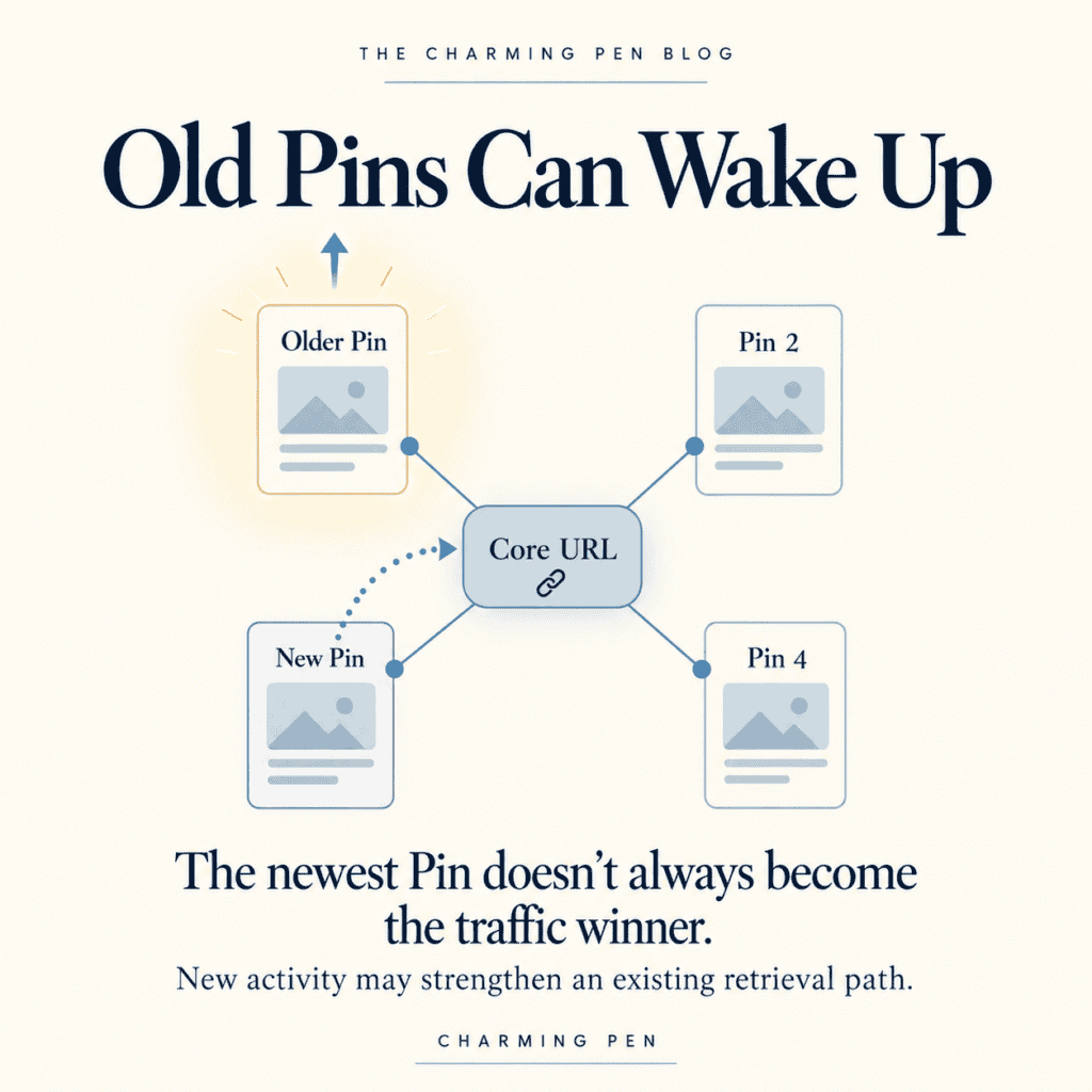
The new Pin does not have to become the traffic winner to be useful.
It may contribute additional information about the underlying URL, reinforce a topic, introduce another legitimate retrieval angle, or simply increase activity around content Pinterest already understands.
This fits much better with the way I increasingly think about Pinterest content: relationally rather than individually.
A URL may have several Pins connected to it.
Those Pins can express slightly different aspects of the same content.
One might emphasize the exact recipe.
Another might emphasize a preparation method.
Another might introduce a seasonal use.
Another may focus on a problem the recipe solves.
Together, they may create a stronger network of information around the URL. I refer to this broader idea as the Pinterest Lattice System—a way of thinking about Pins as connected signals rather than isolated pieces of content.
It helps explain why evaluating every new Pin only by its own direct traffic can be misleading.
The newest Pin may contribute to the system without becoming the Pin that ultimately receives the strongest distribution.
Your Analytics May Be Showing Semantic Expansion
This becomes especially interesting when you intentionally introduce new retrieval angles around existing content.
Suppose a recipe has historically been positioned only around its exact recipe identity.
Then you begin adding legitimate modifiers such as:
Make ahead.
Weeknight.
Freezer friendly.
Holiday side dish.
You have not changed what the recipe is.
You have created more legitimate ways for Pinterest to retrieve it. I explore this idea more directly in One Article, Many Pinterest Search Paths, where I look at how one piece of content can legitimately enter Pinterest search through multiple retrieval routes.
New doors.
Same room.
Pinterest may then need to test those retrieval pathways.
One angle may gain impressions.
Another may generate saves.
Another may produce traffic.
An older Pin associated with the same URL may strengthen.
That movement can show up in analytics before you have a complete explanation for it.
This is why I think controlled elasticity matters.
You want enough semantic breadth to help Pinterest understand additional valid contexts for the content.
But the centre has to remain clear.
Expansion is useful.
Drift is not.
Healthy Expansion vs. Possible Semantic Drift
Healthy expansion stays connected to the original content identity. Pinterest’s recent search-relevance research offers a useful glimpse of how many signals can contribute to that identity. Pinterest says its relevance models can consider Pin titles and descriptions, image captions, linked-page titles and descriptions, board titles, and highly engaged query terms when evaluating the relationship between a query and a Pin.
If the central topic is clear, related retrieval paths can extend outward without replacing it.
You may begin seeing:
- more Pins associated with a URL receiving impressions,
- additional relevant keyword families gaining exposure,
- traffic spreading across several Pins rather than depending on one winner,
- or older Pins regaining traction as the topic becomes more established.
Those can be encouraging signs.

Semantic drift looks different.
If content is repeatedly pushed into weakly related territories, Pinterest may gain more information about the content while becoming less certain about what the content actually represents.
One of the ways I investigate those relationships is by studying the content Pinterest places around a Pin, which I explain in How I Use Pinterest Related Pins to Understand Content Classification.
You might see large impression increases that produce little engagement.
Pins connected to the same URL may behave as though they belong to unrelated topic families.
Strong content may become less consistent after aggressive expansion.
New visibility may appear without meaningful retrieval stability.
None of those patterns independently proves semantic drift.
Pinterest does not give us a metric called classifier confusion.
That is why I use the phrase possible semantic drift.
Analytics are evidence.
Not proof.
When several weak signals appear together, however, they give you something worth investigating.
Sometimes the best next move is not to expand farther.
It is to return to centre.
Pinterest Recovery May Be Phase-Based
Recovery is another area where Pinterest analytics can be misleading if we expect a straight line.
Creators naturally want recovery to look like this:
Traffic falls.
Strategy changes.
Traffic rises.
Problem solved.
In practice, recovery can look much messier.
One content cluster begins improving while another continues declining.
Impressions may stabilize before clicks.
Old Pins may move before new ones.
Traffic can plateau before another group of URLs begins contributing. That uneven movement is also part of why Pinterest traffic can feel so unpredictable when you look only at the account-level graph.
That is why I find it more useful to think in terms of recovery phases.
Compression
An account in trouble can begin to feel compressed.
Fewer Pins receive meaningful distribution.
Traffic becomes dependent on a smaller group of winners.
Strong older Pins may weaken.
Several content areas may stop contributing altogether.
At this stage, I am much less interested in aggressive expansion.
The bigger question is whether Pinterest still appears confident about the account’s core topics and strongest URLs.
Compression often calls for clarity before breadth.
Stabilization
Stabilization is easy to overlook because it is not exciting.
Traffic may stop falling without suddenly increasing.
Some evergreen Pins begin holding their position.
Wild swings become less frequent.
A few URLs start producing more consistent activity.
It may not create an impressive screenshot.
But stopping deterioration matters.
A stable platform gives you something to build on.
Reinforcement
Once the centre appears more stable, reinforcement becomes useful.
That might mean:
new visuals for proven URLs,
clearer modifiers,
better-aligned board placement,
stronger overlays,
or additional Pins that reinforce the same topic from slightly different angles.
The goal is not explosive growth.
It is stronger connections around content Pinterest already seems willing to distribute.
Controlled Expansion
Only after the core becomes more stable would I push harder into broader retrieval territory.
That can include seasonal doorways, adjacent problem-solving contexts, or additional audience needs.
The key is that every expansion still points back to the same content identity.
You are broadening retrieval.
You are not redefining the content.
Beware the Baseline Bump
Another common analytics trap is mistaking movement for meaningful growth.
Pinterest accounts naturally fluctuate.
Seasonality changes.
One strong Pin can temporarily distort account-level metrics.
An older piece of content can resurface.
A topic can suddenly move into its natural search season.
That can create what I think of as a baseline bump.

The graph rises sharply.
Everyone gets excited.
Then the account gradually returns to roughly where it started.
That is very different from a slower rise that establishes a higher operating baseline.
The more useful questions are:
Are more URLs contributing?
Are multiple Pins generating traffic?
Does performance hold after the original spike?
Does Pinterest continue retrieving the content after the immediate surge passes?
Has the account settled at a meaningfully stronger level?
A spike creates excitement.
A higher baseline creates growth.
Don’t React to Every Short-Term Move
This is where analytics can become counterproductive.
If every red down causes a strategy change, you can easily create your own instability.
You change your keywords.
Then your visuals.
Then your posting cadence.
Then your boards.
Then your topic mix.
Then you increase posting because impressions fell.
Then you reduce posting because traffic fell.
Eventually, it becomes difficult to know whether Pinterest is reacting to your strategy or your strategy is reacting to Pinterest.
Pinterest strategy should never really be finished, because adaptation is part of working with a changing platform.
But adaptation should come from patterns, not panic. That pattern-first approach is echoed in Sprout Social’s 2026 Pinterest audit guidance, which recommends looking across impression trends, saves, outbound clicks, Pin longevity, seasonal movement, and content-type performance rather than relying on one number alone.
The time window matters too.
A seven-day decline can look alarming.
Zoom out.
Look at 30 days.
Then 90.
Compare seasonal periods when appropriate.
Move from the account level to the URL level.
Then to individual Pins.
Different time frames answer different questions.
A short window shows movement.
A longer window helps reveal whether the movement matters.
What Should You Actually Watch?
You do not need to record dozens of Pinterest metrics every morning.
In fact, that can make interpretation harder.
For most accounts, I would rather answer a smaller group of meaningful questions.
Are outbound clicks increasing or decreasing over a meaningful period?
Are more or fewer URLs contributing to those clicks?
Is distribution becoming concentrated around fewer Pins?
Are saves, impressions, and clicks moving together or separating?
Are older Pins resurfacing?
Which topic clusters appear to be strengthening?
Are new retrieval angles getting distribution?
Does performance appear compressed, stable, reinforced, or expanding?
Those questions put the raw numbers into context.
They also help prevent one dramatic percentage change from becoming the entire strategy.
Analytics Are Evidence, Not Explanations
This is the principle underneath everything in this article.
Pinterest Analytics can show us that something happened.
They cannot always tell us exactly why.
Pinterest does not expose every internal classification decision, recommendation relationship, audience test, or retrieval pathway taking place behind the scenes.
So I don’t think useful Pinterest strategy comes from pretending we know exactly what the algorithm did.
It comes from disciplined interpretation.
Observe.
Look at what moved.
Compare.
Look at related metrics, URLs, Pins, and time periods.
Hypothesize.
Consider the most plausible explanations without treating them as certainty.
Adjust.
Make a measured change and watch what happens next.
That is the framework.
Pinterest growth is, in many ways, a pattern-recognition problem.
Over time, repeated observations become patterns.
Patterns give you much more to work with than a single green arrow.
Sometimes a red down really is a warning.
Sometimes a green up represents meaningful improvement.
But sometimes fewer impressions mean better distribution quality.
Sometimes a major increase is only broader testing.
Sometimes a new Pin strengthens an older one.
Sometimes an account begins recovering before the overall traffic chart makes that recovery obvious.
And sometimes an exciting spike is only a temporary bump sitting on top of the same baseline.
The goal is not to predict every move Pinterest makes.
It is to become better at reading the signals.
Because the analytics are ultimately giving us evidence about questions Pinterest itself appears to be continually working through:
What is this content?
Who is it for?
Where does it belong?
How do people respond when we show it?
Should we show it again?
The better we become at interpreting those relationships, the less frightening the red downs and green ups become.
And the more useful Pinterest Analytics becomes as a strategy tool.